
A Co-Author Network Adventure
After dipping my toes into cell and gene therapy bibliometrics, I couldn’t resist turning my attention back to my first love: flow cytometry. This blog is part learning journey, part data exploration—so please don’t take these results as definitive. Think of it as a sketch map, not the final atlas.

Harvesting the Data
I started with a simple PubMed search for “flow cytometry.” That alone returned more than 283,000 papers! Since PubMed limits how many references you can download at once, I pulled records year-by-year from 1960 to 2024 and loaded the .txt files into R using the Bibliometrix package. After deduplicating PMIDs, I had a dataset of 276,086 unique references.
Although I’d originally planned to use affiliations and reference lists too, I set them aside for now. That said, here’s a heartfelt plea: please use your organisation’s ROR ID and spell your name the same way on every paper. You’ll make life easier for future bibliometricians—and your own h-index might thank you.
Mapping the Co-Author Landscape
Once I’d cleaned up the author names, I jumped into a co-author network analysis to uncover who’s collaborating with whom. The idea is simple: the more meaningful co-authorships an author has, the more connected (and possibly influential) they are. Of course, I know full well that impactful people don’t always appear on papers—I’ve been left off more than a few myself. Industry scientists and core facility staff are especially under-represented.
The first version of the network graph was, well… monstrous. My 2019 iMac sounded like a jet engine as it tried to process 521,173 authors and over 11 million co-author connections (edges) from papers published between 2014 and 2024. Every analysis took 10+ minutes to respond—or crashed entirely.
Pruning for Performance
To make the graph usable, I trimmed it in stages:
- Time window: I narrowed the range to 2014–2024, which made things manageable.
- Edge weight filtering: I kept only edges with a weight of 2 or more. That means two authors had to co-author at least two papers to remain linked.
- Giant component extraction: I retained only the largest connected subgraph—so no isolated mini-networks.
The result? A clean, focused graph of 36,884 authors and 153,183 co-authorship connections from 197,211 papers (about 71% of the total dataset). It’s not exhaustive, but it’s robust enough to reveal meaningful insights.
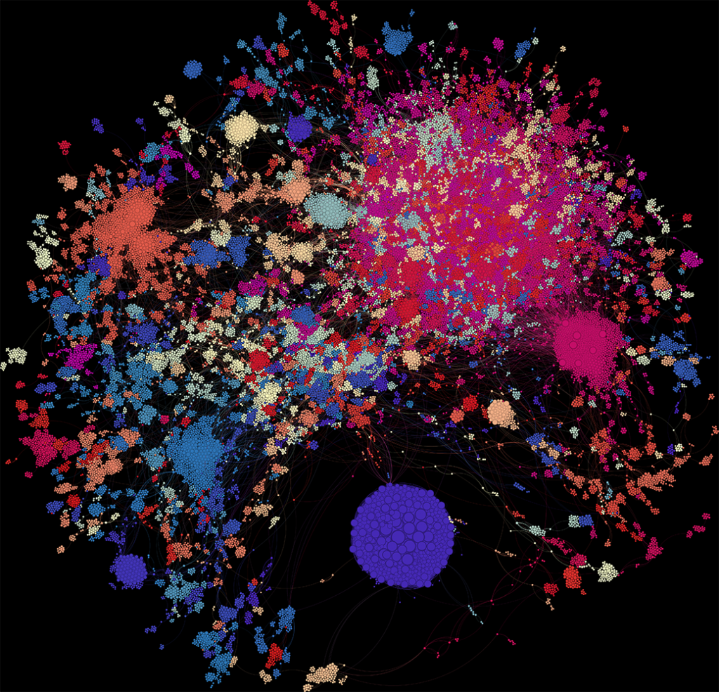
What Does the Graph Show?
In the visualisation:
- Each dot = one author
- Dot size = weighted degree (i.e. total strength of their co-authorship links)
- Colour = modularity class (a rough clustering of connected authors)
There are 134 clusters in total. Let’s zoom in on a few.
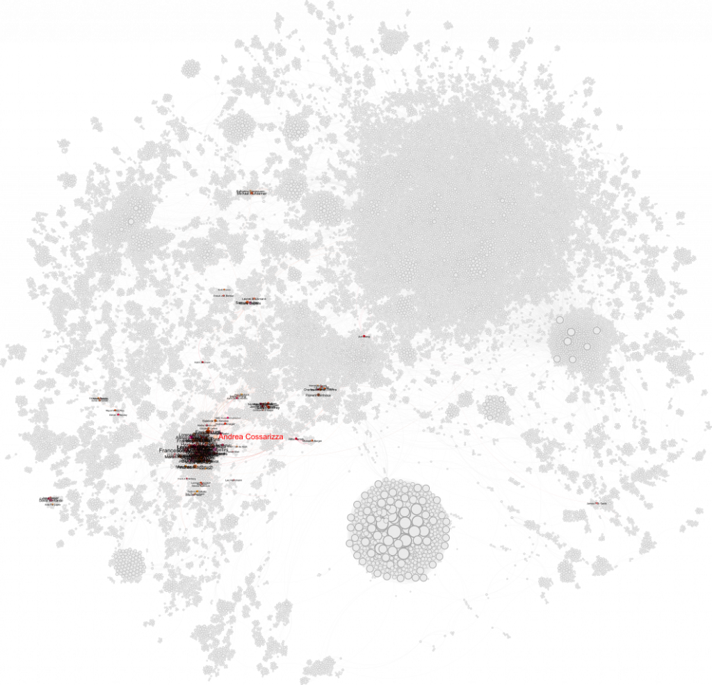
The Flow Cytometry Guidelines Crew
First up: Andrea Cossarizza and the team behind the influential Guidelines for the Use of Flow Cytometry. Their cluster is highly connected and spans the graph—mostly appearing in the blue cluster. The node overlap made it tough to label everything cleanly, but the structure is definitely there.
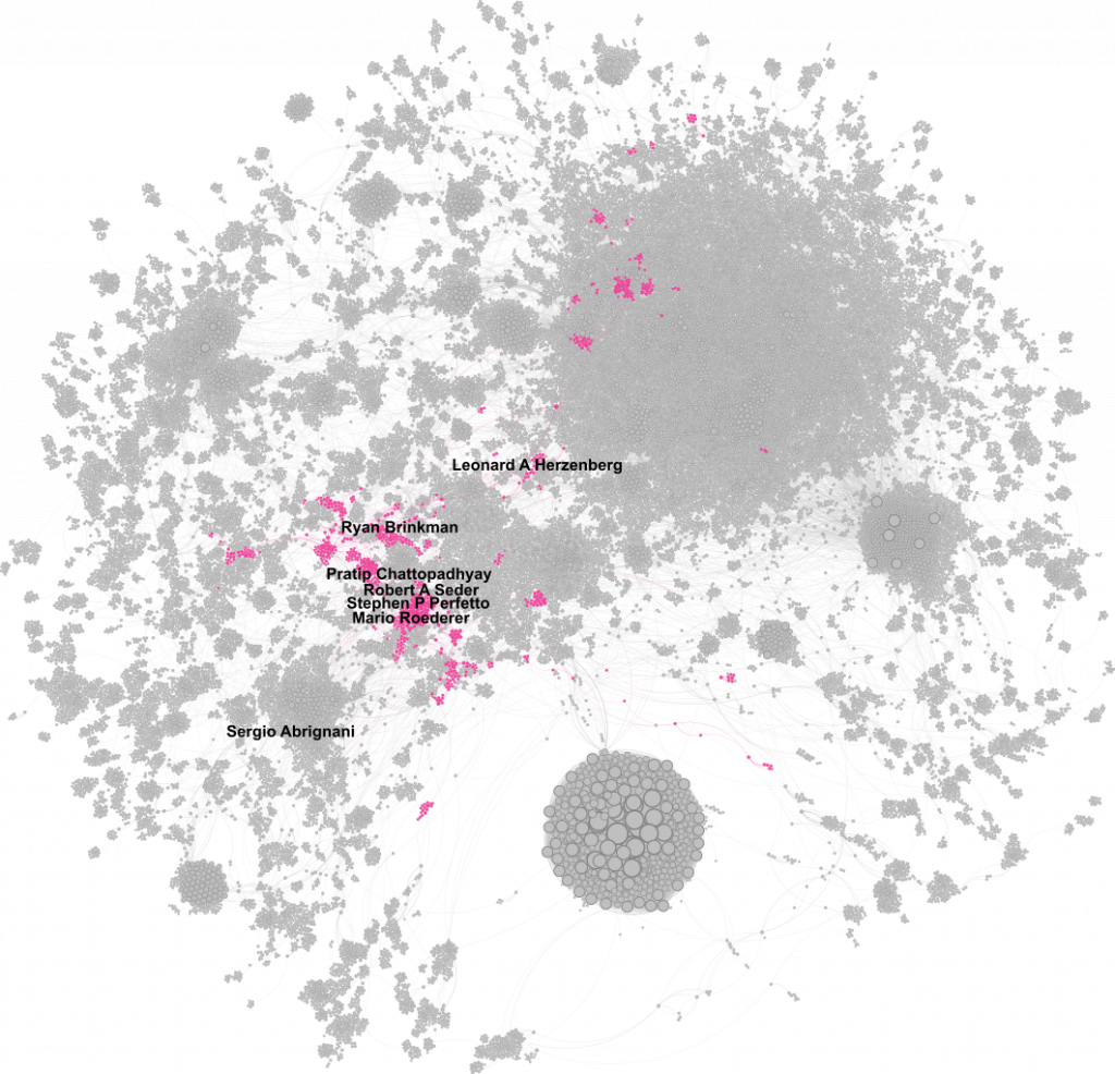
Mario Roederer’s Network
Surely Mario Roederer, one of the field’s titans, is a giant dot? Surprisingly, not quite. While he’s deeply embedded, his node is smaller than I expected. That said, he’s part of a wide-reaching network that includes other big names like Ryan Brinkman and Steve Perfetto. Just a few hops away lies Leonard Herzenberg—Mario’s postdoc supervisor—who holds the highest weighted degree in the entire graph.
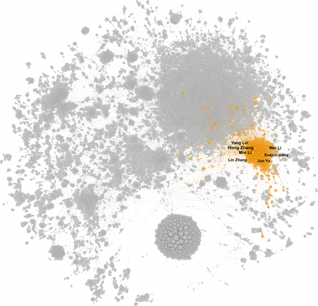
So Who Are the Big Dots?
A cluster of very large, tightly connected nodes appears to the east—dominated by Hong Zhang and Min Li. There are challenges here: “Hong Zhang” is a common name, and neither journals nor PubMed enforce unique identifiers like ORCID. But from what I could find, Min Li is a professor in neuromedicine with 160+ publications, and she’s co-authored 24 papers with an H. Zhang.
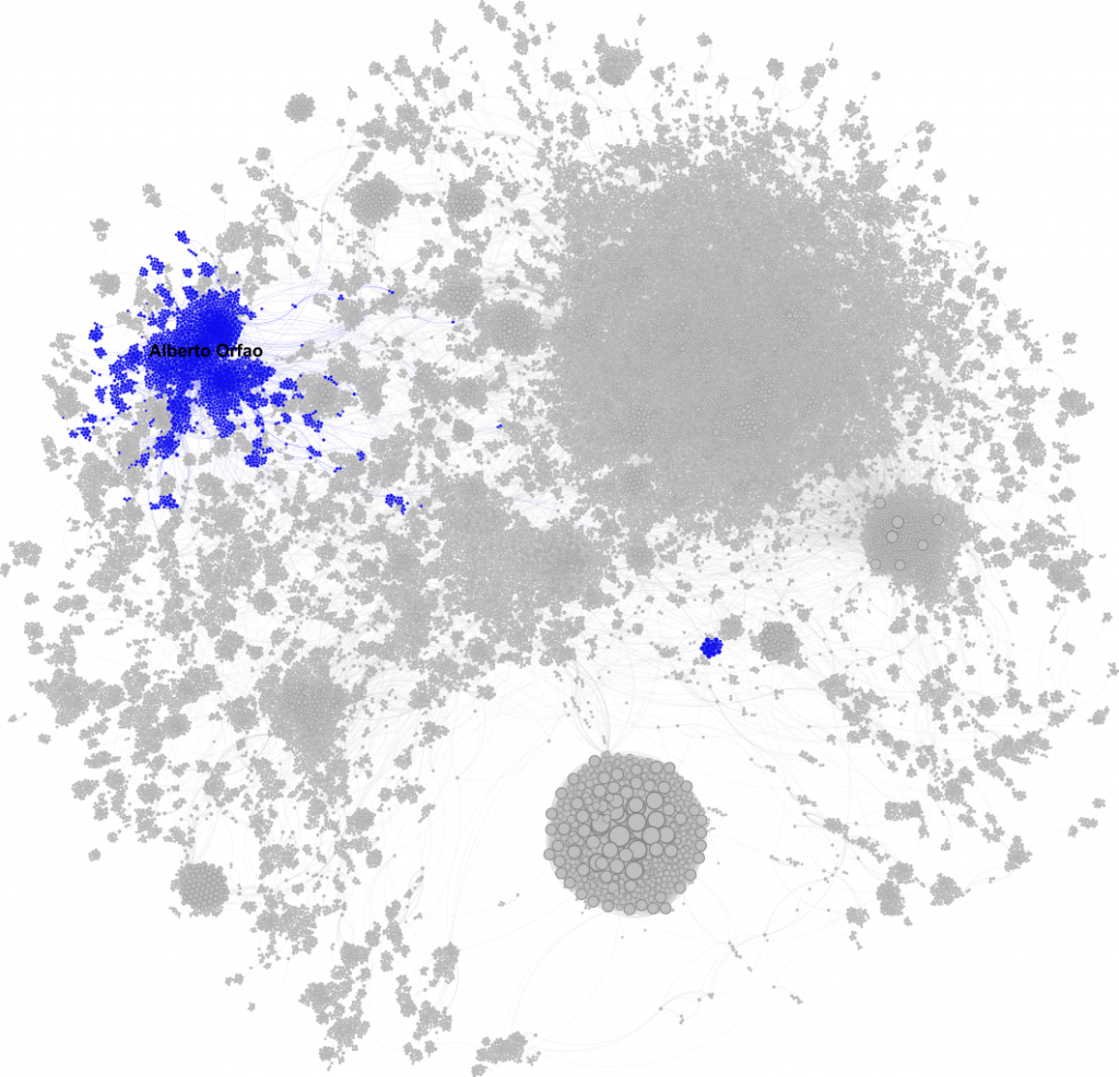
Alberto Orfao: The Network Core
Alberto Orfao’s network spreads across the northwest. He’s central to almost every blue node in the graph, showing a strong cohesive subnetwork. As director of the Cytometry and Cell-Sorting Central Services at the University of Salamanca, his position at the heart of the flow cytometry community makes perfect sense.
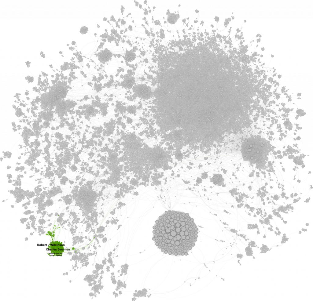
My Own Connections
What about people I’ve worked with? In the southwest corner, my former collaborators and boss form a tight green cluster focused on NSCLC and melanoma. At the centre is Charlie Swanton, co-founder of Achilles Therapeutics alongside Sergio Quezada. Am I in the graph? Sadly, no—I only have one publication with Sergio, so I didn’t meet the inclusion threshold.
The Giant Clusters
Two more clusters stand out:
- Northeast cluster: The largest in terms of author count, but loosely connected. Many authors here seem to be based in Asia, though no clear common theme emerged. It may be a stable layout, or perhaps I’m missing key metadata needed to tease out its structure.
- Saudi cluster: Highly self-connected and prominent. These authors cited themselves frequently—far more than anyone else in the dataset. They form a tight, well-defined network, but I suspect their standout node size may be a methodological artefact of the weighted-degree calculation.
So… Did I Find the Movers and Shakers?
Sort of. I’ve identified promising patterns, but the data still needs refinement. Name disambiguation, affiliation matching, and metadata enrichment will all help. That’s where I’m heading next—starting with organisation-level collaboration networks.
The journey continues…
Let me know what you think—have I missed anyone important? Or do you have ideas for how to clean and improve the data? Drop a comment, share your tips, or just say hi.
Would you like help turning this into a LinkedIn post or visual summary next?
Leave a Reply